The art of framing questions
While working on the design of a demonstration program for customers, they experienced the hard way that framing the question is as important as the question itself.
It was the simplest question of all that caused all the problems. Their intended goal was to ask users whether their monitor was monochrome or color. One of the early attempts consisted in large-letter words in their own vivid colors: GREEN BLUE ORANGE MAGENTA with the following prompt: “Are the words above in color?”.
Lots of the participants who used a monochrome monitor answered this question incorrectly because their monochrome monitor displayed text in green. Actually the failure rate hit 100% for the green-screen monitor users.
The design team iterated, kept the large-letter words and tried other framing:
- Are the words above in more than one color?
- Are the words above in several different colors?
These questions kept failing for some users. By the end, the team came up with a question that worked for all users:
- Do the words above appear in several different colors?
It is not so much different from the other questions, but for the end-user understanding, it made a big difference! In a nutshell, don’t rush on framing the question, even the most simple.
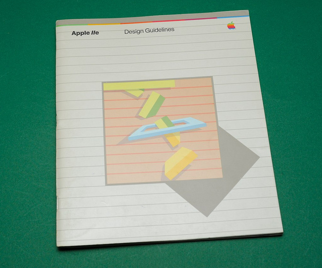
Source: Apple IIe, Design Guidelines, p16-17